How to Group People by Age Bracket Using an Excel Pivot Table

Pivot Table for Age Brackets

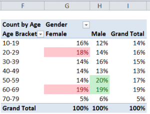
Pivot Table to Group Age Brackets

In my previous Excel Tutorial, I demonstrated how to use the Group Field command in a Pivot Table to summarize time periods by the Hour. Several viewers wanted to know what other grouping possibilities are available in Pivot Tables. One viewer wanted to know how to group people who responded to a survey by Age Brackets. That is why I created this tutorial!

Use DATEDIF Function to Calculate Age

From my perspective, the DATEDIF() is an invaluable function. However, it is not documented in Excel. Watch how I use its three arguments to calculate the age of each person in the data set.

Group Field by Age

Select a single value in the “Age” Field and then select the “Group Field” Command. In the dialog box, choose the “step-value” for your groups. In this case, I chose the Default Setting of 10 years.

Show Pivot Table Values As

Some of the most powerful Pivot Table tools are found on the “Show Values As” tab of the “Value Field Settings” Dialog Box. Watch me demonstrate how to show each Age Bracket as a Percentage of the Column.

Apply Conditional Formatting to Pivot Table

Take advantage of the greatly improved Conditional Formatting Commands in Excel 2007 and Excel 2010 to focus attention on the key information in your Pivot Table. In this case, I use the “Top 10 Items” rule to apply Conditional Formatting to the two highest Age Brackets- by percentage – for each gender.

Learn Excel Pivot Tables Quickly

Follow this link to learn about the focused 90 minute video tutorials that I have published to help you to really learn how to get the most out of Pivot Tables. Available in versions for Excel 2003, Excel 2007, and Excel 2010.

Watch Tutorial in High Definition

Click on this link to watch this Excel Tutorial in High Definition on my YouTube Channel – DannyRocksExcels


How to Group an Excel Pivot Table Field to Summarize By Hours

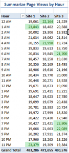
Pivot Table Summary Report By Hour

Pivot Table Summary Report By Hour

After viewing my previous video tutorial, one of my subscribers asked me to demonstrate how to actually summarize a minute-by-minute Excel report into an hour-by-hour report.

My viewer was unfamiliar with Pivot Tables – as are many Excel users – so I created this video to show him – and you how to do this.

Group a Pivot Table Field

Begin by right-clicking a single cell in the Time Field and choosing Group Field. In the dialog box, deselect Month and choose Hour. That’s it – it’s that simple!

Apply Conditional Formatting to the Top 10%

Beginning with Excel 2007, Conditional Formatting has been tremendously improved. Watch how I apply a “Top 10%” Conditional Format Rule with three mouse clicks!

Purchase My 90 Minute Focused Pivot Table Tutorial

Whether you are a novice or an experienced user of Excel Pivot Tables, you will learn some great Tips and Techniques when you purchase my 90 minute video tutorial: “Summarize, Analyze and Present Information with Excel Pivot Tables.”

Follow this link to learn more about my video tutorial for Pivot Tables. Available for ALL versions of Excel as either a DVD-ROM or as a Downloadable Product.

Watch Video Tutorial in High Definition

Click on this link to watch this Excel Video Tutorial in High Definition on my YouTube Channel – DannyRocksExcels


Create a Pivot Chart to Present a Frequency Distribution Report

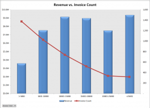
Combination Chart for Frequency Report

Quite a few of my viewers requested that I continue my series of creating and presenting a “Frequency Distribution Report” using an Excel Pivot Table. So, here is the new Part 3 in the series!

In this Excel Video Tutorial, I demonstrate – using Excel 2010 – how to create a Pivot Chart for the Frequency Distribution Pivot Table that I created and modified in Parts 1 and 2 of this series.

Key Point: A Pivot Chart Must be based on a Pivot Table Report!

  • Any structural changes that you make to the Pivot Table are reflected in the Pivot Chart.
  • If you “filter” the Pivot Chart, those filters apply to the Pivot Table that is the basis for your Pivot Chart – and vice versa.

Focus on the Chart

As I demonstrate in this video – posted on YouTube – I prefer to focus on one task at a time. I prefer to get the formatting and structure of the Chart “right” before I think about using Filers and other “goodies to add .” This “Best Practice” helps me to get more accomplished in less time!

My bottom line is: “Focus on the task at hand. Eliminate any possible distractions from that primary task!”

A correctly designed Pivot Chart will help you to present your information accurately and interactively! For this presentation, I decided that a “Combination Chart” would be the best way to present the information that I wanted to convey. A “Combination Chart” allows you to have a Primary Axis (Revenue) that uses a Column Chart Type and a Secondary Axis (Invoice Count) that uses a Line Chart Type.

When to Use a Secondary Chart Axis

In this example, there is a wide difference between the two fields that we are charting:

  • Revenue for the Invoices in the “Bin Range” is in “the millions!
  • Count of Invoices in the “Bin Range” falls into the hundreds and low thousands.

Using a “Combination Chart” in this example – (Column Chart for Revenue in Millions) and Count of Invoices (Line Chart for Count in Hundreds) allows you to present the “relationship” between both metrics. I show you step-by-step how to create this combination chart!


Watch This Video in High Definition on YouTube

Follow this link to view this video tutorial in High Definition on my YouTube Channel – DannyRocksExcels

Click this link to view Part 1 of the 3 Part series – Creating a Frequency Distribution  Report with Excel Pivot Table

Click this link to view Part 2 of the 3 Part series – Formatting a Frequency Distribution Report with Excel Pivot Table

Formatting an Excel Pivot Table Frequency Report

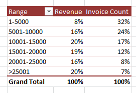
Show % in Frequency Report

Show % of in Frequency Report

This is Part 2 of my 2-part series on Excel Pivot Table Frequency Reports. A Frequency Report is a great way to answer these questions:

  • How many invoices did we generate for values under $5,000?
  • How many invoices did we gererate for values over $15,000?

In this part, I show you how to format the Frequency Report to make it easier to present the information.

Formatting the Frequency Report

Here are the changes that I made to improve the look of the Frequency Report:

  • Reduced the number of “bins” in the frequency range by changing the “Grouping.”
  • Changed the formatting to make large numbers (millions) easier to read – e.g. as $3.2M
  • Made a copy of the Pivot Table to show values as “% of Total.”

Click on this link to go to Part 1 in this series of video tutorials for Pivot Table Frequency Reports

Learn How to Use Pivot Tables

I have created a series of video tutorials that you can download to learn how to create and modify Excel Pivot Tables. You can choose to download the recording that fits your version of Excel (2003, 2007 or Excel 2010). The cost is $9.95 for the video recording and that includes the Excel workbooks that I used and a step-by-step instructional manual. Follow this link to get more information about these recordings.

Watch this Video in High Definition on YouTube

Follow this link to watch this video tutorial on my YouTube Channel – DannyRocksExcels

Use Excel Pivot Table to Determine Frequency Distribution of Invoice Amounts

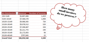
Frequency Distribution

Frequency Distribution of Invoices

Has your manager ever asked you,  “How many small invoices do we process?” Of course, you do not know that number immediately. However, you can produce the answer within about 2 minutes when you use an Excel Pivot Table.

Amazing?

Group Fields in a Pivot Table

Yes. And, easy to produce thanks to the “Group Fields” tools in an Excel Pivot Table – in any version of Excel!

In fact, I demonstrate how to produce the frequency distribution in:

  • Excel 2010 / Excel 2007
  • Excel 2003

Download My Pivot Table Video Recordings

This give me the opportunity to announce that I have published a series of Video Tutorial Recordings for Excel Pivot Tables – on my WebEx by Cisco website –  that you can download for only $9.95 USD!

Follow this link to get more information and to follow the direct links to download these recordings.

It is so easy to produce this Pivot Table report that you will be amazed – and want to learn more. That is why I have decided to produce a sequel to this lesson. I will post Part 2 tomorrow. In that segment, I will help you to answer your manager’s question – “How many of these invoices do we process each your?”

Just make me one promise! Do not tell your manager how easy it is to produce these reports!

Of course, I am joking about this. But, most people who do not work with Pivot Tables on a regular basis have no idea how easy it is to harness the analytical and presentation power of Pivot Tables. Once you watch these lessons – and download my video recordings – you will know a lot more about Pivot Tables.

Watch This Video in High Definition on YouTube

Click here to watch this video on my YouTube Channel – DannyRocksExcels – in High Definition

Click here to go to Part 2 in this series – Formatting a Frequency Distribution Report for Presentation