How to Use Excel’s Histogram Tool and The 80/20 Rule of Analysis

Histogram Charts in Excel

Excel Histogram Charts

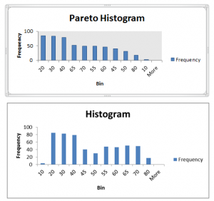
This is the Third – and final – episode in my “Creating Frequency Distribution Reports in Excel” series of tutorials.  In this episode, I demonstrate a very powerful – and very easy to use – analysis tool – The Histogram Tool.

Excel’s Analysis ToolPak “Add-in”

This tool is included in the Analysis ToolPak which is an “Add-in” program within Excel. Beginning with Excel 2007, the Analysis ToolPak is automatically included in a basic installation of Excel. However, if you are using an earlier version of Excel or if, somehow, this Add-in has been disabled, I show you how to “activate it.”

Advantages of Using Excel’s Histogram Tool

  • No Formulas to write
  • Results are Numeric Values – not Formulas
  • Chart(s) can be added automatically
  • Multiple Chart Options
  • Pareto Chart Option

What is a Pareto Chart?

Pareto Analysis is commonly known as “The 80 / 20 Rule.” A brief explanation is: Roughly 80% of your sales come from only 20% of your customers or 20% of your products. I like to say, “You can focus on the Vital Few and not on the Trivial Many,” when you use Pareto Charts. As you will see in my video, when you choose the Pareto Chart option, the Histogram automatically sorts the Frequency Field in descending order and charts this field.

Links to All Videos in Frequency Report Series

Improve your Excel Skills – My Video Tutorials

I invite you to visit my secure online shopping website to see the many training resources that I offer. For example, click here to learn about my best-selling DVD-ROM, “The 50 Best Tips for Excel 2007.”

Follow The Company Rocks on Facebook

You can now follow me on Facebook – www.facebook.com/TheCompanyRocks
 

Share and Enjoy:
  • Add to favorites
  • Facebook
  • Twitter
  • Technorati
  • Print
  • email
  • Digg
  • StumbleUpon
  • del.icio.us
  • Yahoo! Buzz
  • Google Bookmarks
  • Orkut
  • SphereIt
  • Sphinn

Create a Pivot Chart to Present a Frequency Distribution Report

Combination Chart for Frequency Report

Quite a few of my viewers requested that I continue my series of creating and presenting a “Frequency Distribution Report” using an Excel Pivot Table. So, here is the new Part 3 in the series!

In this Excel Video Tutorial, I demonstrate – using Excel 2010 – how to create a Pivot Chart for the Frequency Distribution Pivot Table that I created and modified in Parts 1 and 2 of this series.

Key Point: A Pivot Chart Must be based on a Pivot Table Report!

  • Any structural changes that you make to the Pivot Table are reflected in the Pivot Chart.
  • If you “filter” the Pivot Chart, those filters apply to the Pivot Table that is the basis for your Pivot Chart – and vice versa.

Focus on the Chart

As I demonstrate in this video – posted on YouTube – I prefer to focus on one task at a time. I prefer to get the formatting and structure of the Chart “right” before I think about using Filers and other “goodies to add .” This “Best Practice” helps me to get more accomplished in less time!

My bottom line is: “Focus on the task at hand. Eliminate any possible distractions from that primary task!”

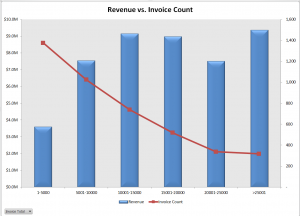
A correctly designed Pivot Chart will help you to present your information accurately and interactively! For this presentation, I decided that a “Combination Chart” would be the best way to present the information that I wanted to convey. A “Combination Chart” allows you to have a Primary Axis (Revenue) that uses a Column Chart Type and a Secondary Axis (Invoice Count) that uses a Line Chart Type.

When to Use a Secondary Chart Axis

In this example, there is a wide difference between the two fields that we are charting:

  • Revenue for the Invoices in the “Bin Range” is in “the millions!
  • Count of Invoices in the “Bin Range” falls into the hundreds and low thousands.

Using a “Combination Chart” in this example – (Column Chart for Revenue in Millions) and Count of Invoices (Line Chart for Count in Hundreds) allows you to present the “relationship” between both metrics. I show you step-by-step how to create this combination chart!


Watch This Video in High Definition on YouTube

Follow this link to view this video tutorial in High Definition on my YouTube Channel – DannyRocksExcels

Click this link to view Part 1 of the 3 Part series – Creating a Frequency Distribution  Report with Excel Pivot Table

Click this link to view Part 2 of the 3 Part series – Formatting a Frequency Distribution Report with Excel Pivot Table

Share and Enjoy:
  • Add to favorites
  • Facebook
  • Twitter
  • Technorati
  • Print
  • email
  • Digg
  • StumbleUpon
  • del.icio.us
  • Yahoo! Buzz
  • Google Bookmarks
  • Orkut
  • SphereIt
  • Sphinn

Creating Combination Charts in Excel

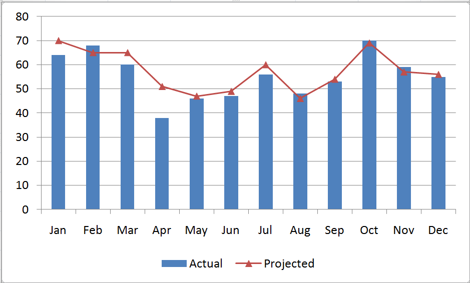
A combination chart in Excel is not a single chart type. Rather, you create combination charts by combining two or more complementary chart types. The most common combination is a Column type for one series and a Line type chart for the second series. Combination Charts, in general, make it easier to spot or highlight the trends in your data.

Combination Chart

Excel Combination Chart

 Creating a Combination Chart

  1. Create a standard chart for your data.
  2. Select one series and then choose a different chart type for that series.
  3. Make formatting choices as necessary.

Adding a Secondary Axis for Data

When you are comparing data series that have a wide “gap” between them – e.g. comparing actual sales in a month (large number) – to Profit % in each month (small number), you will want to create a Secondary Vertical (Value) Axis in your Combination Chart.

Begin by selecting the series that you want to plot and Right Mouse Click to Format the Series on a Secondary Vertical Axis. I recommend that you add in Axis Titles for both the Primary and Secondary Vertical Axes.

Formatting Charts in Excel 2007 and 2010

Charting in Excel – beginning with Version 2007 – now offers quite a few professional graphic design elements. In this video lesson, I show you how to customize the presentation of your graphical image. You can make these changes with just a few mouse clicks! It is definitely worthwhile to learn how to improve the visual impact that your Combination Charts make.

Learn how to “Master Excel in Minutes – Not Months!”

Follow this link to watch this Excel Video in High Definition, Full Screen Mode on my YouTube Channel – DannyRocksExcels

Subscribe to or watch my – free – video podcast on iTunes.

Share and Enjoy:
  • Add to favorites
  • Facebook
  • Twitter
  • Technorati
  • Print
  • email
  • Digg
  • StumbleUpon
  • del.icio.us
  • Yahoo! Buzz
  • Google Bookmarks
  • Orkut
  • SphereIt
  • Sphinn

Create Dynamic Chart Titles in Excel

A viewer wrote to ask for my help in creating dynamic chart titles in Excel. He has created a series of pivot table reports and pivot charts. He wants the titles for his charts to update dynamically. That is, as he selects a new filter for his pivot table, he wants the title in his pivot chart to match the value label in his filter.

Dynamic Chart Titles


Note: 

This technique will work for all Excel Charts and Chart Types. It is not restricted to Pivot Tables.

The solution is rather simple: You link the Chart Title to a formula.

Link Chart Title to Formula

Select a cell that is outside the range of your Pivot Table – let’s say cell H1. An example formula is:

=”Sales for Fiscal Year “&D1

In this case, cell D1 contains the label for the value that you are selecting to filter your Pivot Table Report and Chart – e.g. 2008 as your Fiscal Year.

Notice that in the formula, I include the “TEXT” inside ” ” (double quotation marks. I also use the & (ampersand) to join the text to the cell reference (D1).

Finally, select the Chart Title and then, in the formula bar type =H1 (where H1 is the cell that contains the formula that we just wrote).

As a finishing touch, you can “hide” the formula in cell H1 by changing the FONT COLOR to match the background color for that cell.

It is that easy! Try it yourself after you watch this short (6 minutes) video lesson.

Invitation to Visit My New Online Shopping Site

Shop for The 50 Best Tips for Excel 2007

Shop for The 50 Best Tips for Excel 2007

My new, secure, online shopping website – http://shop.thecompanyrocks.com – is now open. I invite you to stop by for a visit and get more information about the many resources  that I offer for sale including, “Learn how to “Master Excel in Minutes – Not Months!”

Watch Tutorial in High Definition

Follow this link to my YouTube Channel – DannyRocksExcels – where you can watch this video lesson in High Definition, Full-screen mode.

Share and Enjoy:
  • Add to favorites
  • Facebook
  • Twitter
  • Technorati
  • Print
  • email
  • Digg
  • StumbleUpon
  • del.icio.us
  • Yahoo! Buzz
  • Google Bookmarks
  • Orkut
  • SphereIt
  • Sphinn

Use a Combo Box to Dynamically Change Your Excel Chart Data

You can “drive” your Excel Charts – dynamically change the data behind the chart. Focus your audience’s attention on the information that you are discussing. Let your audience see a chart that illustrates the scenario that they select.

To do this – add a Combo Box that lists the choices for each chart display that you offer!

(Click here to view my free Excel Training lesson on Combo Box Controls for more information.)

Key Steps to Take:

  • Use the INDEX() Function to look-up the values for your chart data.
  • For the 2nd argument in the INDEX() Function select the cell that is the “cell link” for your Combo Box. Use the F4 Keyboard Shortcut to make this part of the formula “Absolute.”
  • Insert the Chart Type that best represents your data. Position your chart adjacent to the Combo Box.

Click here to watch this video on my YouTube Channel – DannyRocksExcels –  in High Definition and Full Screen Mode.

I have several lessons that cover Charting in Excel 2007 on my DVD, “The 50 Best Tips for Excel 2007.” Buy it now!

Learn to “Master Excel in Minutes – Not Months!”

Share and Enjoy:
  • Add to favorites
  • Facebook
  • Twitter
  • Technorati
  • Print
  • email
  • Digg
  • StumbleUpon
  • del.icio.us
  • Yahoo! Buzz
  • Google Bookmarks
  • Orkut
  • SphereIt
  • Sphinn

How to Create a Thermometer Chart in Excel

When you want to create a chart that tracks your progress towards reaching a goal – e.g. Monthly Sales Goal – use a Thermometer Chart in Excel. This is a fairly easy chart to create. However, there are a few “got’cha” steps along the way to avoid. Here are the key points to consider when creating a thermometer chart in Excel:

  • Base the chart on one cell. This cell contains the formula =”month to date number” / goal – formatted as a percentage.
  • Be sure to clearly separate this one cell from the other cells – e.g. insert a blank row about the formula cell.
  • Begin with a Column Chart Type.
  • Format your Vertical Axis on the chart – the percentage values. Set the Minimum Value to be “fixed” at 0.0 and the Maximum Value to be “fixed” at 1.0
  • Add a Data Label to your chart – there are several options for placing this on the chart.
  • Continue to format your chart as desired.

Follow this link if you want to watch this video in High Definition, Full Screen Output.

You can learn more about creating and formatting charts on my DVD, “The 50 Best Tips for Excel 2007.” Click here to add this to your secure shopping cart.

Share and Enjoy:
  • Add to favorites
  • Facebook
  • Twitter
  • Technorati
  • Print
  • email
  • Digg
  • StumbleUpon
  • del.icio.us
  • Yahoo! Buzz
  • Google Bookmarks
  • Orkut
  • SphereIt
  • Sphinn

Click & Drag a Data Series to Goal Seek in Excel

Did you know that you can click on a Data Series in an Excel Chart and “drag it to reach a new value?” You can!

Changing the data value in your chart brings up the Goal Seek Dialog Box. Now, it is a simple matter to confirm your new value and tell Excel which cell reference to change in your formula. Instantly, your chart redraws and your data and formula are updated with the substitute value – and your NEW GOAL!

Here are the steps to follow in this Excel Video Lesson:

  1. I use the =FV() Function to show the future value of my investment for each year that we invest. The =FV() Function requires a “fixed” interest rate and a constant investment value contributed each period.
  2. I inserted a “Line” type chart onto my worksheet – i.e. I “embedded” the chart on the sheet.
  3. I used a “Custom Format” on the Value Axis for our numbers (#,##0,K) to show the numbers as thousands ($80K)
  4. For this chart, I also changed the “Maximum Value” of the Value Series by typing in a new (higher) number.
  5. To reach a “new goal” on our chart, first click to select the data series. Then click again and drag the data line to a new point on the chart.
  6. This brings up the “Goal Seek” Dialog Box. Edit your new goal if necessary. Then click on the cell that you want to change in order reach your goal. That cell must be referenced in your formula. The chart redraws and your formula results are updated.

Find the Excel Video Lesson that you want – Index of all Excel Topics

News! My DVD, “The 50 Best Tips for Excel 2007” is now available to purchase. I invite you to visit my online bookstore for more details.

Share and Enjoy:
  • Add to favorites
  • Facebook
  • Twitter
  • Technorati
  • Print
  • email
  • Digg
  • StumbleUpon
  • del.icio.us
  • Yahoo! Buzz
  • Google Bookmarks
  • Orkut
  • SphereIt
  • Sphinn

How to Create a Combination Chart in Excel

What is a Combination Chart? When do I use one? Why do I use one?

  1. What: A combination chart uses two different chart types in the same graphic representation of your data.
  2. When: There is a large value gap between one data series and the other data series.
  3. Why: To reveal the relationships in your data that may not be apparent with a traditional chart or by merely examining the data.

In this short video lesson, I will demonstrate “How” to transform a traditional column chart into a Combination Chart that reveals an interesting data relationship.

Here are the steps to follow in this Excel Video Lesson:

  1. Start with a standard Excel Chart – Here we used the F11 Key to create a Column Chart in a separate worksheet.
  2. Notice the wide gap between the two data series. Click on one of the series columns (in this case “Dollars”) and on the Chart Toolbar select the “Line” chart type.
  3. A wide gap in values remains between the two series. With the “Dollars” series selected, choose Format Series on the Toolbar. Click the Axis Tab and select “Plot Series on Secondary Axis.”
  4. Format the chart to suit your needs. In this example, we change the color of the Plot Area and add Text to a “Call out” shape on the chart.

Find the Excel Video Lesson that you want. Index of all Excel Topics

News! My DVD, “The 50 Best Tips for Excel 2007” is now available to purchase. I invite you to visit my online bookstore for more details.

Related Videos

Share and Enjoy:
  • Add to favorites
  • Facebook
  • Twitter
  • Technorati
  • Print
  • email
  • Digg
  • StumbleUpon
  • del.icio.us
  • Yahoo! Buzz
  • Google Bookmarks
  • Orkut
  • SphereIt
  • Sphinn

How to Explode a Pie Slice in Your Chart!

Pie Charts are the most popular charts – to create. Pie Charts are not always the best chart to use to tell your story. The people who create charts want to create Pie Charts and they want to “Explode” slices of the pie.

In this video I will demonstrate how to format your Pie Chart – and “explode” it!

Here are the steps to follow in this Excel Video Lesson:

  1. Select the chart first so that you can format it. (If your chart is on its own worksheet, select that worksheet tab.)
  2. Use the Drop-Down menu on the Chart Toolbar to become familiar with each Chart Element.
  3. Select the Chart Element and then click the Format Chart Element Icon on the toolbar.
  4. Format the “Plot Area.” Remove the Border and change the Background to White.
  5. Select the Chart Series “Total” – the Pie – and format it. On the Data Labels tab, select Percentage and Category Names.
  6. You no longer need the Legend. Select it and press Delete.
  7. Select the Plot Area and drag the sizing handles to enlarge it.
  8. To “explode” a pie slice, first select the Series “Total” – the Pie. After a short pause, select the slice that you want to “explode” to choose it. (You will see multiple “handles” around this slice.) Click on the border of the slice and drag it away from the Pie.
  9. To print only the chart: Select it and then make your changes in Print Preview – Page Setup.

Find the Excel Video Lesson that you want – Index to all Excel Topics

News! My DVD, “The 50 Best Tips for Excel 2007” is now available to purchase. I invite you to visit my online bookstore for more details.

Related Videos

Share and Enjoy:
  • Add to favorites
  • Facebook
  • Twitter
  • Technorati
  • Print
  • email
  • Digg
  • StumbleUpon
  • del.icio.us
  • Yahoo! Buzz
  • Google Bookmarks
  • Orkut
  • SphereIt
  • Sphinn

Create an Excel Chart With One Keystroke!

It is easy to create a chart in MS Excel 2003. So easy, in fact, that you can create your chart with one keystroke.

In this video, I reveal that keystroke. I also demonstrate how easy it is to change the chart type and the location of your chart.

Here are the steps to follow in this Excel Video Lesson:

  1. Select one cell in your data set and press the F11 key.
  2. Excel, by default, creates a Column Chart in a new worksheet.
  3. Using the Chart tool bar, you can change the chart type.
  4. Select the data range(s) you want to chart  before you press the F11 key.
  5. Consider what “picture” you want to share before you create your chart.
  6. Use the Chart Wizard – Step 4 – to move the location of the cart (from its own worksheet to an embedded object in your worksheet – or vice versa.)

Find the Excel Video Lesson that you want – Index to all Excel Topics

News! My DVD, “The 50 Best Tips for Excel 2007” is now availabe to purchase. I invite you to visit my online bookstore for more details.

Related Videos

Share and Enjoy:
  • Add to favorites
  • Facebook
  • Twitter
  • Technorati
  • Print
  • email
  • Digg
  • StumbleUpon
  • del.icio.us
  • Yahoo! Buzz
  • Google Bookmarks
  • Orkut
  • SphereIt
  • Sphinn